
Website accessibility means building a website so more people can use it, understand it, and interact with it without unnecessary barriers. It helps visitors who use screen readers, keyboards, voice tools, captions, zoom settings, or high-contrast displays. However, accessibility is not only for people with permanent disabilities. It also helps users on small screens, slow connections, bright sunlight, temporary injuries, and noisy environments.
For beginners, accessibility can sound technical at first. The good news is that many improvements are simple. Clear headings, readable text, strong color contrast, descriptive links, useful image alt text, keyboard-friendly forms, and mobile-friendly layouts can make a major difference.
In this guide, you will learn the basics of website accessibility in plain language. We will cover why accessibility matters, how to improve readability, how keyboard navigation works, how to write alt text, how forms should behave, and how to audit a website before publishing changes.
What Is Website Accessibility?
Website accessibility is the practice of designing and developing websites that can be used by people with different abilities, devices, and browsing situations. It includes visual design, content structure, code quality, media, forms, navigation, and interaction patterns.
A website is more accessible when users can read content clearly, move through pages with a keyboard, understand images through alt text, submit forms without confusion, and use assistive technologies without losing information. Therefore, accessibility is both a design responsibility and a development responsibility.
The W3C Web Accessibility Initiative explains accessibility as an essential part of web quality. In simple terms, a good website should not exclude users just because they browse differently.
Why Website Accessibility Matters for Beginners
Website accessibility matters because every visitor deserves a clear and usable experience. A person may not use a mouse. Another visitor may need larger text. Someone else may depend on captions, strong contrast, or a screen reader. If your website ignores these needs, important users may not be able to complete simple actions.
Accessibility also improves business performance. Clear structure helps visitors understand your offer faster. Better contrast improves readability. Good forms reduce mistakes. Keyboard-friendly navigation makes important pages easier to reach. As a result, accessibility can support trust, engagement, and conversions.

In addition, accessible websites often support SEO. Search engines benefit from clear headings, descriptive links, meaningful image alt text, and crawlable structure. Google also encourages helpful, people-first content that serves real users. You can read more in Google Search Central.
Core Website Accessibility Principles
The most common accessibility framework is called WCAG, which stands for Web Content Accessibility Guidelines. WCAG is built around four principles: perceivable, operable, understandable, and robust. These words may sound formal, but the ideas are practical.
Perceivable means users can recognize the content. For example, text should be readable, images should have alt text when needed, and videos should include captions. Operable means users can interact with the website through different methods, including a keyboard.
Understandable means users can predict what will happen and understand the content. Robust means the website works with modern browsers and assistive technologies. The official WCAG overview is a useful reference when you want to go deeper.
Website Accessibility Starts With Readability and Color Contrast
Readability is one of the easiest places to begin. If visitors cannot read your content comfortably, the website fails before they reach your offer. Good readability depends on font size, line height, paragraph length, contrast, spacing, and background simplicity.
Color contrast is especially important. Light gray text on a white background may look soft, but it can be hard to read. Thin fonts, low-contrast buttons, and text over busy images can also create problems. Therefore, always test important text against its background.
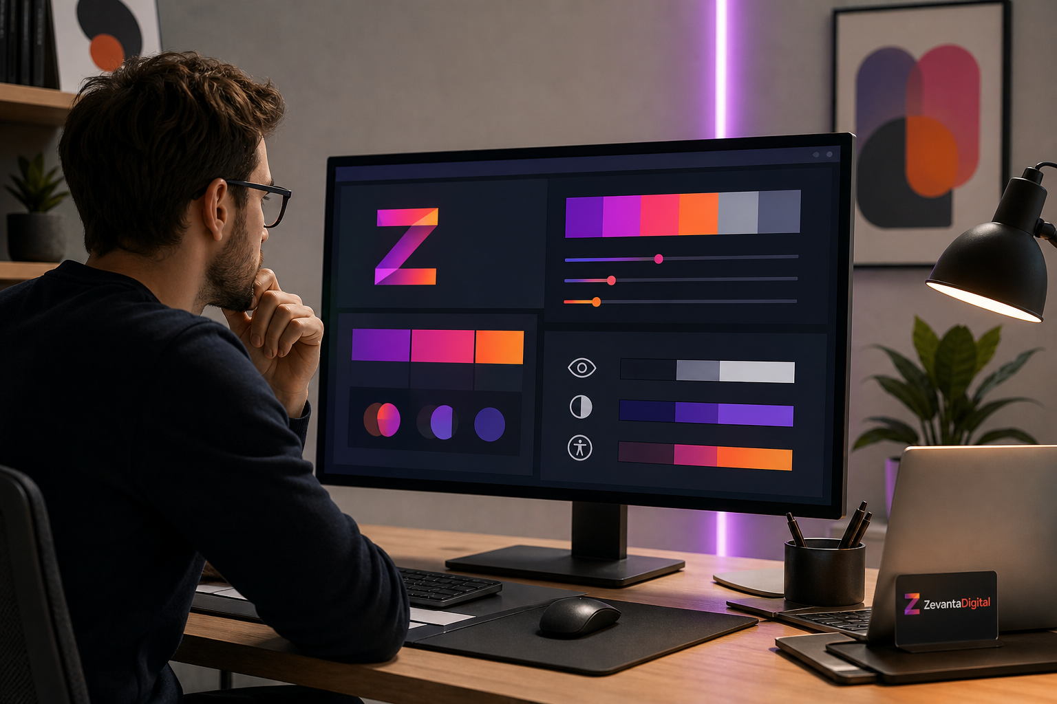
Beginners should aim for strong contrast on body text, buttons, menus, forms, and captions. Also, do not use color alone to communicate meaning. If an error message is only red without an icon or explanation, some users may miss the message.
Keyboard Navigation Is Essential for Website Accessibility
Many users navigate websites with a keyboard instead of a mouse. They may press Tab to move between links, buttons, fields, and menus. If your website does not support keyboard navigation, users can get stuck.
Every interactive element should be reachable with the keyboard. Buttons should behave like buttons. Links should behave like links. Menus, dropdowns, modals, and forms should not trap users or hide focus. In addition, the visible focus outline should be clear enough to see.
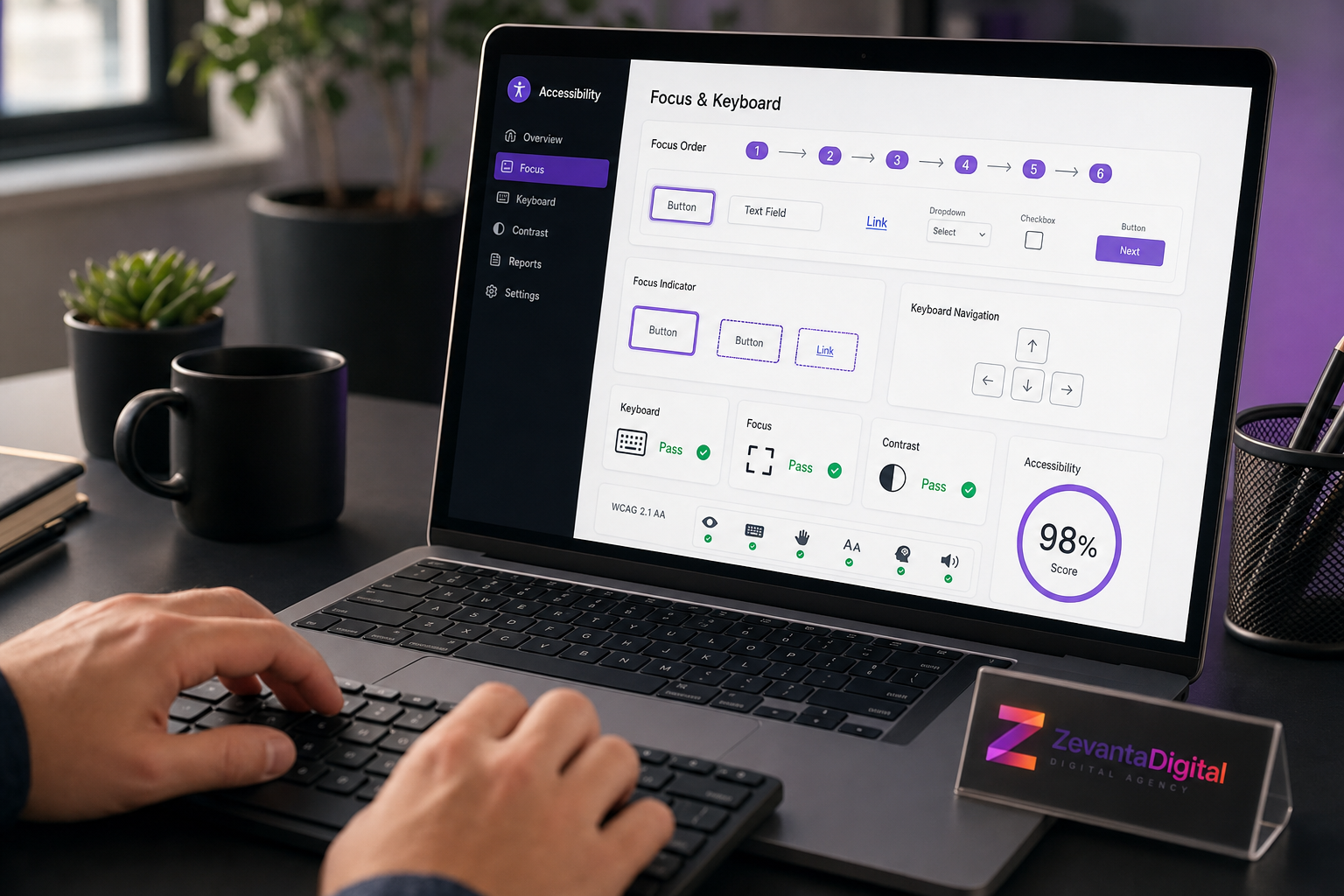
A quick beginner test is simple. Open your website and use only the Tab, Shift + Tab, Enter, Space, and Escape keys. If you cannot open menus, reach buttons, close popups, or submit forms, the experience needs improvement.
Use Alt Text to Improve Website Accessibility
Alt text is a short written description of an image. Screen readers can announce it to users who cannot see the image. Search engines may also use it to understand image context. However, alt text should be useful, not stuffed with keywords.
Write alt text based on the purpose of the image. If the image explains a process, describe the process. If it shows a product, describe the product clearly. If it is decorative and adds no useful meaning, it may need empty alt text so screen readers can skip it.
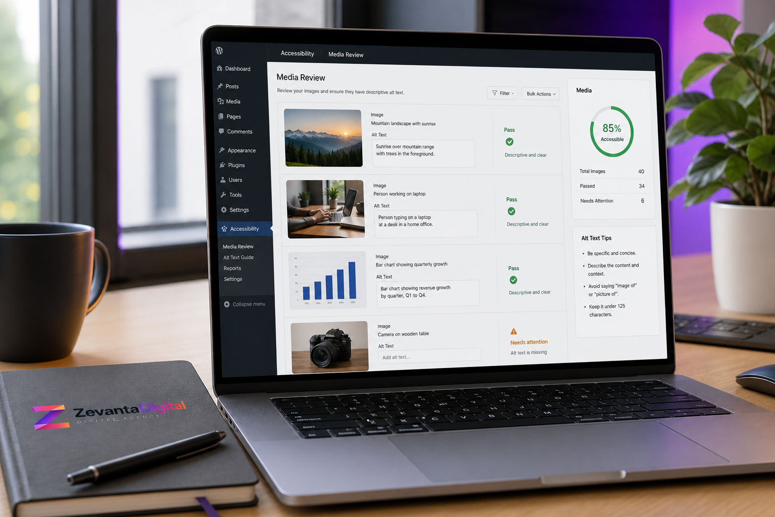
For example, “designer reviewing a website accessibility dashboard” is more helpful than “image123” or “best website accessibility guide for beginners professional SEO image.” Keep it natural and specific. Also, make sure important information is not locked inside images only.
Accessible Forms Help Users Complete Actions
Forms are important because they often turn visitors into leads, customers, subscribers, or applicants. If a form is not accessible, users may not be able to contact your business. This can directly affect conversions.
Every field should have a clear label. Placeholder text should not replace labels because it disappears when users type. Error messages should explain what went wrong and how to fix it. Required fields should be obvious, and confirmation messages should be clear after submission.
Also, test forms on mobile. Fields should be easy to tap, spacing should be comfortable, and validation should not feel confusing. For service websites, the contact form should ask only for information needed to begin a useful conversation.
Headings and Links Should Be Clear
Headings help users scan a page. They also help screen reader users move between sections. Because of this, headings should follow a logical order. Use one main page title, then H2 headings for major sections, and H3 headings for supporting details.
Links should also be descriptive. “Read our web design services” is clearer than “click here.” If multiple links say “learn more,” users may not know where each link goes. Therefore, link text should describe the destination or action.
Internal links can support accessibility and SEO when used naturally. For example, a blog post can guide readers to Services, Projects, Blog, or Contact when those pages help the reader continue their journey.
Accessible Website vs Inaccessible Website
| Area | Accessible Website | Inaccessible Website |
|---|---|---|
| Text | Readable size, strong contrast, clear spacing | Small text, weak contrast, crowded layout |
| Navigation | Works with mouse, touch, and keyboard | Depends only on hover or mouse clicks |
| Images | Helpful alt text where needed | Missing, vague, or keyword-stuffed alt text |
| Forms | Clear labels, errors, and confirmation | Hidden labels and confusing validation |
| Content | Logical headings and simple language | Messy structure and unclear link text |
| Testing | Checked with tools and manual review | Published without accessibility checks |
This comparison shows that accessibility is practical. It is not only about compliance. It is about reducing friction so more users can complete real tasks on your website.
Step-by-Step Website Accessibility Guide for Beginners
Step 1: Check Readability
Review your font sizes, line spacing, contrast, and paragraph length. Make sure users can read your content comfortably on desktop and mobile.
Step 2: Test Keyboard Navigation
Use the keyboard to move through the site. Check menus, links, buttons, forms, modals, and dropdowns. The focus indicator should always be visible.
Step 3: Review Image Alt Text
Look at every meaningful image. Add clear alt text that explains the image purpose. Avoid keyword stuffing, and skip decorative images when they add no meaning.
Step 4: Improve Forms
Check labels, required fields, error messages, field spacing, and confirmation messages. Then test the full form flow on mobile.
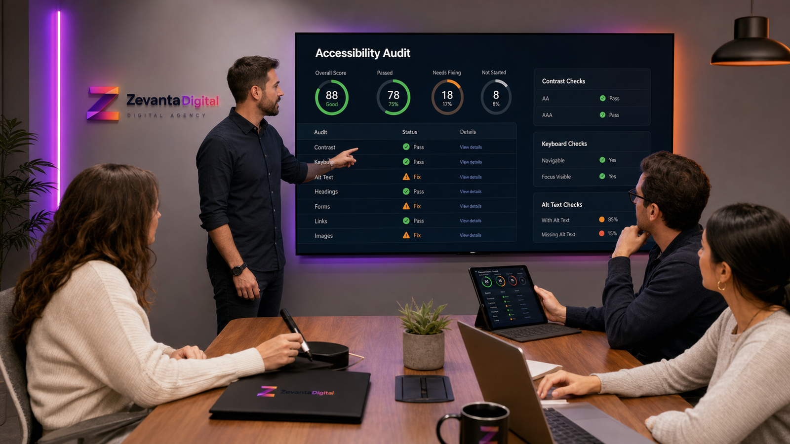
Step 5: Run an Accessibility Audit
Use tools to find common issues, but also review manually. Tools are helpful, yet they cannot understand every content or design decision.
Key Benefits of Website Accessibility
- More people can use your website comfortably.
- Content becomes easier to read and understand.
- Forms become easier to complete.
- Mobile and keyboard users get a smoother experience.
- SEO structure often improves through better headings and alt text.
- Your brand feels more professional and responsible.
- Conversion paths become clearer for every visitor.
Real-World Website Accessibility Use Cases
A digital agency website may improve accessibility by making service pages easier to scan, adding clearer form labels, and ensuring dropdown menus work with a keyboard. This helps potential clients compare services without frustration.
An ecommerce website may add better product alt text, improve color contrast on price labels, and make checkout errors easier to fix. As a result, more shoppers can complete purchases confidently.
A healthcare or education website may need accessible documents, clear headings, captions, and strong form support. In these industries, accessibility is especially important because users often need accurate information quickly.
Common Website Accessibility Mistakes
One common mistake is using low-contrast text because it looks elegant. Unfortunately, low contrast can make content hard to read. Another mistake is hiding important information inside images without adding accessible alternatives.
Many websites also remove focus outlines because they dislike the look. This creates a serious problem for keyboard users. Instead, focus styles should be designed beautifully and clearly.
Another mistake is relying only on automated tools. Tools can identify many issues, but they cannot judge whether content is clear, link text is meaningful, or a user journey feels easy. Manual review is still important.
Website Accessibility Best Practices
Start accessibility early in the design process. It is easier to choose readable colors, clear layouts, and proper components before development begins. However, existing websites can still improve through focused updates.
Use semantic HTML whenever possible. Proper buttons, links, headings, lists, and form labels give browsers and assistive technologies useful information. Also, keep interactions predictable. Users should understand what will happen before they click.
Finally, make accessibility part of ongoing maintenance. Review new images, new pages, plugin updates, forms, and design changes before they go live. This keeps the website usable as it grows.
Helpful Website Accessibility Testing Tools
Beginners can start with browser-based tools such as Lighthouse, WAVE, and axe DevTools. These tools can flag missing alt text, contrast issues, form label problems, heading structure concerns, and other common accessibility problems.
Microsoft also provides helpful inclusive design resources that explain how people use technology in different ways. You can explore Microsoft Inclusive Design for broader thinking beyond technical checklists.
Still, tools are only the beginning. Test with a keyboard. Zoom the page. Use mobile devices. Read the content out loud. If possible, involve real users. These steps reveal issues that automated checks may miss.
Website Accessibility Tips for WordPress Sites
WordPress gives beginners a flexible way to manage content, but accessibility still depends on how the site is built and maintained. A lightweight theme, clean page structure, properly labeled forms, optimized images, and careful plugin choices all matter.
When adding content in WordPress, use heading blocks in the correct order. Do not choose headings only because they look bigger. Use lists for grouped points, add alt text to meaningful images, and avoid placing important text inside images. Also, preview each page on mobile before saving it as ready.
Plugins can help, but they cannot fix everything automatically. Some accessibility overlay tools promise instant compliance, yet they may not solve deeper design, content, or code problems. Therefore, use tools as support, not as a replacement for good UX and development practices.
Make Website Accessibility an Ongoing Habit
Accessibility is not a one-time task. Every new page, image, form, popup, plugin, or design change can introduce new issues. Because of this, teams should review accessibility during normal website updates, not only during major redesigns.
A simple monthly checklist can help. Review new images, test key forms, check important pages with a keyboard, confirm headings make sense, and scan a few pages with an accessibility tool. This habit keeps small issues from becoming large problems.
Most importantly, treat accessibility as part of quality. A premium website should not only look impressive. It should also feel clear, inclusive, and dependable for the people who use it.
How Zevanta Digital Helps With Website Accessibility
Zevanta Digital helps businesses improve website accessibility through UX audits, UI design, WordPress development, content structure, performance optimization, and conversion-focused improvements. We look at accessibility as part of the full user experience, not as an isolated checklist.
Our team can review your current website, identify readability issues, improve forms, fix navigation problems, optimize media, and create accessible layouts that feel modern and professional. Therefore, your website can become easier to use while still looking premium.
If your website looks good but visitors still struggle to read, navigate, or contact you, accessibility improvements can make the experience more helpful and trustworthy.
Frequently Asked Questions
What is website accessibility?
Website accessibility means designing and developing a website so people with different abilities, devices, and browsing methods can use it effectively.
Why is website accessibility important?
It helps more users read content, navigate pages, submit forms, and complete actions without barriers. It can also support trust, SEO, and conversions.
Is accessibility only for disabled users?
No. Accessibility helps disabled users, but it also helps people using phones, slow connections, bright screens, temporary injuries, or different input methods.
How do beginners test website accessibility?
Start by checking contrast, using keyboard navigation, reviewing image alt text, testing forms, and running tools such as Lighthouse or WAVE.
Does website accessibility help SEO?
Yes, it can help indirectly because accessible websites often use clearer headings, better links, descriptive images, and stronger content structure.
How can Zevanta Digital help my business?
Zevanta Digital can audit your website, improve accessibility issues, redesign key sections, optimize WordPress pages, and make the user journey easier for more visitors.
Conclusion
Website accessibility is not only a technical requirement. It is a practical way to make your website clearer, easier, and more useful for real people. Beginners can make meaningful progress by improving readability, keyboard navigation, alt text, forms, headings, and testing habits.
Overall, accessible websites create better experiences for more visitors. They also support trust, SEO, and conversions because users can understand the content and complete important actions with less friction.
Ready to Improve Your Website Accessibility?
Your website should be easy to read, navigate, and use for every visitor. Better accessibility can improve trust, usability, SEO structure, and lead generation.
Zevanta Digital can help you audit, design, develop, and optimize a more accessible website experience.
Start Your Accessibility Project