

Homepage Design Best Practices for Small Businesses help owners create a homepage that looks professional, explains the offer clearly, and guides visitors toward action. However, many small business websites fail because the homepage tries to say everything at once.
In addition, your homepage is often the first serious impression a customer has of your company. As a result, it should communicate trust, value, and direction within a few seconds.
This guide explains how to plan a strong homepage, what sections to include, how to improve mobile experience, and how to avoid common design mistakes. You will also learn how Zevanta Digital can help small businesses build cleaner, faster, and more conversion-focused websites.
Table of Contents
- What Is Homepage Design?
- Why Homepage Design Matters
- Important Homepage Sections
- Mobile Homepage Design
- Homepage Comparison
- Step-by-Step Guide
- Common Mistakes
- FAQs
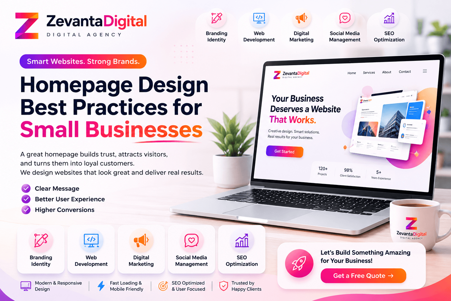
What Is Homepage Design for Small Businesses?
Simply put, homepage design is the planning, layout, content, and visual structure of the main page of a website. For small businesses, the homepage must quickly explain who you are, what you offer, who you help, and why visitors should trust you.
For example, a local service company may need a homepage that highlights services, reviews, service areas, and a quote button. Meanwhile, a software company may need a homepage that explains features, use cases, demos, and support options.
Therefore, the best homepage is not only attractive. It is useful. It guides visitors from curiosity to confidence by answering questions in a logical order.
Why Homepage Design Best Practices Matter
Your homepage affects trust, search performance, user experience, and conversions. If visitors cannot understand your message quickly, they may leave before exploring your services. Because of this, design clarity is a business issue, not only a visual preference.
Moreover, small businesses often compete with larger brands. A professional homepage helps level the field. It shows that your company is active, credible, and ready to serve customers.
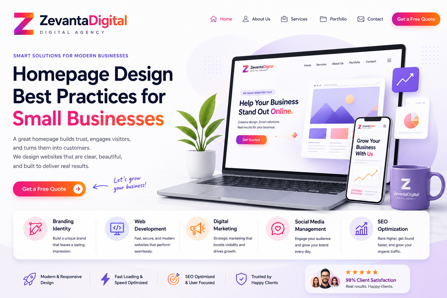
Essential Homepage Sections for Small Business Websites
First, start with a clear hero section. The headline should explain the offer in plain English. The supporting text should describe the benefit. The main button should tell visitors what to do next.
Next, show your core services. Keep this section simple. List the main services with short descriptions and link each service to a detailed page. This helps visitors choose the right path without feeling overwhelmed.
Then, add proof. Testimonials, project examples, ratings, certifications, and client results make your claims stronger. For this reason, proof should appear before the final CTA, not only at the bottom.
Finally, include a clear contact section. Add a form, email, phone number, location details, or booking button based on your business model. Also, make sure the same action is easy to find throughout the page.
Homepage Copy Should Be Simple
Good homepage copy uses short sentences and clear benefits. Instead of writing long paragraphs about your company history, explain what customers get. In other words, connect every section to the visitor problem or goal.
Homepage Calls to Action Should Be Clear
A call to action should be specific. For example, Book a Free Call, Request a Quote, View Services, or Start a Project is clearer than Submit. As a result, visitors understand the next step before they click.

Mobile Homepage Design Best Practices
Mobile users need fast clarity. Therefore, the homepage should load quickly, use readable type, keep buttons large enough to tap, and avoid crowded sections. A mobile visitor should not need to pinch, zoom, or search for the contact button.
In addition, mobile layouts should reduce unnecessary decoration. Large images, sliders, and heavy animations can slow the experience. Google explains the importance of loading, responsiveness, and visual stability in Core Web Vitals.
Good Homepage Design vs Weak Homepage Design
| Feature | Weak Homepage | Strong Homepage |
|---|---|---|
| Headline | Vague or clever | Clear and benefit-focused |
| Layout | Random sections | Logical visitor journey |
| CTA | Hidden or generic | Visible and specific |
| Trust | Few proof points | Reviews, work examples, and process |
| Mobile | Crowded and slow | Readable, fast, and touch-friendly |
Overall, the difference is focus. A weak homepage only fills space. However, a strong homepage helps visitors make a decision. This is why structure, copy, speed, and trust all matter together.
Step-by-Step Guide to Better Homepage Design
- First, define the main goal of the homepage.
- Next, write a clear headline and supporting message.
- Then, plan sections in the order visitors need them.
- After that, add trust signals near important CTAs.
- In addition, optimize the page for mobile and speed.
- Finally, track clicks, form submissions, and calls after launch.
Key Benefits of Better Homepage Design
- More visitors understand your business quickly.
- More people click the right service or contact button.
- Your brand feels more professional and trustworthy.
- Mobile users get a smoother experience.
- SEO pages gain stronger internal linking opportunities.
Real-World Homepage Design Use Cases
A local contractor can use the homepage to show services, locations, reviews, and quote buttons. Meanwhile, a digital agency can use the homepage to explain services, show projects, and invite visitors to start a project.
Similarly, a clinic can highlight appointments, doctors, patient trust, and opening hours. An ecommerce brand can guide visitors toward best-selling categories, offers, and product benefits. Therefore, homepage design should match the customer journey.
Common Homepage Design Mistakes
Common mistakes include vague headlines, too many buttons, slow hero images, weak mobile spacing, missing testimonials, unclear services, and hidden contact options. However, most of these problems can be fixed with better planning.
Another mistake is using a homepage like a full company brochure. Instead, the homepage should guide visitors to the next best page. For example, link to services, projects, blog, and contact when relevant.
Best Practices for Homepage Design Success
First, write the message before designing the layout. Next, use simple navigation. Then, keep the most important CTA visible. Also, compress images and avoid heavy scripts. Finally, review performance and user behavior after launch.
For SEO basics, review Moz Beginner Guide to SEO. For WordPress website management, the WordPress documentation is also useful.
How Zevanta Digital Helps With Homepage Design
Zevanta Digital helps small businesses plan, design, and develop homepages that feel professional and support real goals. Moreover, our team focuses on UI/UX design, WordPress development, speed optimization, SEO structure, and conversion-focused content.
As a result, your homepage can become more than a digital introduction. It can become a clear path for visitors to understand your services, trust your brand, and contact your team.
Frequently Asked Questions
What is homepage design?
Homepage design is the layout, content, visual style, and user experience of the main page of a website. It helps visitors understand the business and choose the next step.
Why is homepage design important for small businesses?
Because the homepage often creates the first impression. A clear homepage can improve trust, reduce confusion, and increase contact or sales opportunities.
What should a small business homepage include?
A small business homepage should include a clear headline, service overview, benefits, proof, process, contact options, and a strong call to action.
How can I make my homepage convert better?
Start with clearer messaging, stronger CTAs, faster loading, mobile-friendly sections, testimonials, and simple navigation.
Should homepage design be mobile-first?
Yes. Most visitors use mobile devices often, so the homepage should be easy to read, tap, and navigate on smaller screens.
How can Zevanta Digital help my business?
Zevanta Digital can help your business design or improve a homepage that supports trust, SEO, user experience, and lead generation.
Conclusion
Homepage Design Best Practices for Small Businesses are about clarity, trust, speed, and action. In other words, your homepage should help visitors quickly understand your offer and feel confident enough to continue.
Ready to Improve Your Homepage?
If your homepage looks fine but does not generate enough leads, it may need better structure, copy, and conversion strategy. Therefore, contact Zevanta Digital to plan a homepage that supports your business goals.