

Website user experience is the way visitors feel when they open, read, browse, and use your website. If the page loads fast, the layout feels clear, the content answers real questions, and the next step is easy to find, people stay longer. However, if the site feels slow, crowded, confusing, or hard to use on mobile, visitors leave before they understand your offer.
For small businesses, agencies, startups, and service companies, UX is not only a design topic. It directly affects trust, leads, sales, SEO, and brand perception. A beautiful website can still fail if users cannot find information, compare services, read content comfortably, or contact the business without friction.
In this guide, you will learn how to improve website user experience with practical steps. We will cover navigation, speed, mobile design, content clarity, accessibility, forms, conversion paths, analytics, and continuous improvement. The goal is simple: make your website easier, faster, and more useful for real people.
What Is Website User Experience?
Website user experience describes the complete journey a visitor has on your site. It starts before they click. Search results, page titles, and expectations shape the first impression. Then, once the page opens, users judge the design, speed, structure, copy, images, buttons, and overall ease of use.
Good UX feels almost invisible. Visitors do not stop to think about the layout because the experience feels natural. They can scan the page, understand the offer, find proof, compare options, and take action without confusion. As a result, they are more likely to trust the business.
Poor UX creates small points of friction. A slow hero image, unclear menu label, weak contrast, long paragraph, hidden contact button, or broken mobile section can reduce confidence. One issue may seem minor. Together, these issues can lower conversions and damage the user journey.
Why Website User Experience Matters for Business Growth
Website user experience matters because users make quick decisions. Most visitors do not read every word. Instead, they scan headings, images, buttons, testimonials, and service details. If the website helps them understand value quickly, they continue. If it creates doubt, they move on.
Moreover, UX supports SEO. Google recommends creating helpful, people-first content and strong page experiences. Clear structure, mobile usability, fast loading, accessible content, and useful internal links all help visitors and search engines understand your website better. You can learn more from Google Search Central.

Better UX can also improve lead quality. When visitors can easily understand services, pricing factors, process, proof, and contact options, they contact you with clearer expectations. Therefore, UX reduces confusion before the sales conversation even begins.
Start With a Website User Experience Audit
Before redesigning anything, audit the current experience. Open your website like a first-time visitor. Ask simple questions: what does this business do, who is it for, why should I trust it, and what should I do next? If the answers are not clear within a few seconds, the page needs improvement.
Next, review analytics. Look at pages with high exits, low engagement, weak form submissions, or poor mobile performance. These signals do not tell the full story, but they show where users may be struggling. In addition, ask real customers what they found confusing before contacting you.
A UX audit should check navigation, content clarity, page speed, visual hierarchy, accessibility, forms, trust signals, internal links, and mobile behavior. This gives you a practical improvement plan instead of random design changes.
Also, note the difference between personal opinion and user evidence. A team may like a design because it looks modern, but users may still struggle with the layout. Therefore, combine expert review with real behavior data whenever possible.
Improve Website User Experience With Clear Navigation
Navigation is one of the fastest ways to improve UX. A visitor should be able to find services, projects, blog resources, about information, and contact details without hunting. Therefore, keep your main menu focused and easy to scan.
Use familiar labels. For example, “Services” is often clearer than a clever phrase. “Contact” is clearer than “Let’s Talk” when someone is scanning quickly. Creativity can help brand personality, but menu labels should reduce thinking.
Also, organize dropdowns carefully. Group related services together and avoid long lists that feel overwhelming. If you offer web development, SEO, digital marketing, and AI automation, each category should guide users toward the right service page. You can also connect blog posts to service pages with helpful internal links such as Services, Projects, and Contact.
Website Speed Is a Core Part of User Experience
Speed affects how users feel before they even read your content. A slow website creates frustration. It also makes a business feel less professional. On the other hand, a fast site feels smooth, reliable, and easier to trust.
Start with the basics. Compress images, use modern formats, reduce unused scripts, avoid heavy sliders, and keep the layout stable while the page loads. In WordPress, performance also depends on theme quality, plugin choices, hosting, caching, and how assets are loaded.

Google’s Core Web Vitals explain important user-centered speed metrics such as loading performance, responsiveness, and visual stability. However, do not optimize only for scores. The real goal is to make the website feel fast and usable for visitors.
Mobile Website User Experience Must Be Simple
Many visitors will first experience your website on a phone. Because of this, mobile UX cannot be an afterthought. Buttons must be easy to tap. Text must be readable. Forms must be short. Menus must open smoothly. Most importantly, users should not need to pinch, zoom, or fight with the layout.
Mobile pages should focus on priority content. A homepage may need a clear headline, short value statement, proof, services, and one main action. Long decorative sections can slow the experience, especially on small screens.
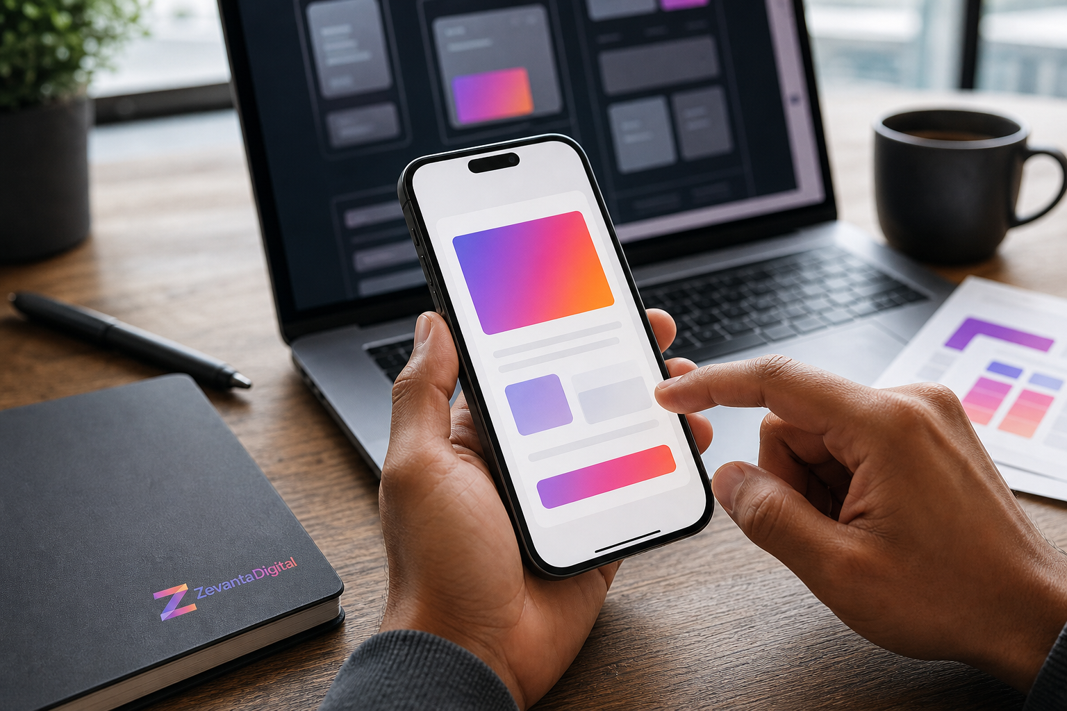
In addition, check spacing. Crowded mobile layouts cause accidental taps and visual stress. Use enough space around buttons, form fields, and cards. Also, make sure sticky headers do not cover too much of the screen.
Use Clear Content to Improve Website User Experience
Content is part of UX. A visitor cannot have a good experience if the words are vague, complicated, or too promotional. Clear content explains what you offer, who it helps, why it matters, and what happens next.
Use short paragraphs, descriptive headings, and simple explanations. Avoid long blocks of text that feel heavy. Instead, break important points into bullets, steps, examples, and short sections. This makes the page easier to scan and easier to understand.
For service pages, answer common buyer questions. Explain the process, deliverables, timeline factors, tools, benefits, and proof. For blog posts, educate first and promote services naturally. This approach supports trust and E-E-A-T because readers feel helped instead of pressured.
Build a Strong Visual Hierarchy
Visual hierarchy guides attention. It tells users what to read first, what matters most, and where to click. Without hierarchy, every element competes for attention. The page may look busy even if the design is technically modern.
Use clear heading sizes, consistent spacing, readable body text, strong contrast, and focused sections. Important calls to action should stand out, but they should not appear everywhere. Too many buttons can weaken the user journey.
Images should support the content. They should not only decorate the page. A good image helps the reader understand the topic, feel the quality of the brand, and stay engaged with the article.
Accessibility Improves Website User Experience for Everyone
Accessibility is not only for a small group of users. It improves the experience for everyone. Better contrast, readable fonts, keyboard-friendly navigation, descriptive alt text, clear form labels, and logical headings all make websites easier to use.
For example, someone may browse your website outdoors on a bright screen. Strong contrast helps them read. Another person may use keyboard navigation. Visible focus states help them move through the page. Someone else may rely on a screen reader. Proper headings and alt text make content understandable.

The W3C Web Accessibility Initiative provides helpful guidance for creating more inclusive digital experiences. Therefore, accessibility should be part of every UX improvement plan.
Make Forms and Contact Paths Easy
Forms often decide whether a visitor becomes a lead. If a form asks for too much information too early, users may leave. If the form is confusing, broken, or hard to use on mobile, conversions drop.
Keep forms focused. Ask only for information you need to start a useful conversation. Use clear labels, helpful placeholders, error messages, and confirmation messages. Also, make sure phone, email, and contact buttons are visible where users naturally need them.
For service businesses, a strong contact path usually includes a contact page, a short form, direct email, optional phone or booking link, and trust signals near the form. This reduces hesitation at the final step.
Good UX vs Poor UX: A Practical Comparison
| UX Area | Good Website UX | Poor Website UX |
|---|---|---|
| Navigation | Clear menu with familiar labels | Crowded menu with confusing terms |
| Speed | Pages load quickly and feel stable | Heavy pages, slow scripts, layout shifts |
| Mobile | Readable, touch-friendly, and focused | Tiny text, cramped buttons, broken sections |
| Content | Simple, useful, and easy to scan | Long, vague, or overly promotional |
| Forms | Short forms with clear labels | Long forms with unclear errors |
| Accessibility | Strong contrast and keyboard support | Low contrast and hidden focus states |
This comparison shows that UX is not one single feature. It is the result of many small decisions. When each decision removes friction, the whole website becomes easier to use.
Step-by-Step Guide to Improve Website User Experience
Step 1: Review User Goals
Start by listing what visitors want to do. They may want to understand your services, compare proof, read pricing guidance, learn about your process, or contact your team. Then, make sure the website supports those goals clearly.
Step 2: Simplify the Layout
Remove visual clutter. Keep sections focused on one idea at a time. Use consistent spacing, clear headings, and direct buttons. As a result, visitors can scan the page without feeling overwhelmed.
Step 3: Improve Mobile and Speed
Test the website on real phones. Check loading time, menu behavior, button spacing, forms, and image size. Then, optimize assets and remove unnecessary scripts that slow the experience.
Step 4: Strengthen Trust Signals
Add testimonials, case studies, portfolio examples, client results, certifications, or process details where they support decisions. However, keep them relevant. Trust signals should answer doubts, not distract from the page goal.
Step 5: Measure and Improve
UX improvement is ongoing. Review analytics, user behavior, form submissions, and customer feedback. Then, make small improvements regularly. This is usually better than waiting years for a full redesign.
Key Benefits of Better Website User Experience
- Visitors understand your business faster.
- Pages feel more professional and trustworthy.
- Mobile users can browse without frustration.
- Forms become easier to complete.
- Internal links guide users to useful content.
- SEO performance can improve through better engagement and structure.
- Conversion paths feel more natural.
- Customers contact you with clearer expectations.
Real-World Website User Experience Use Cases
A digital agency may improve UX by simplifying its services menu, adding project proof, and making the contact path visible after service explanations. This helps clients compare expertise before booking a call.

An ecommerce website may improve UX by reducing checkout steps, showing shipping details earlier, and making product filters easier to use. Consequently, shoppers spend less time struggling and more time buying.
A local service business may improve UX by making phone contact, service areas, reviews, and quote forms easier to find. This supports users who need quick confidence before choosing a provider.
Common Website User Experience Mistakes
One common mistake is designing for appearance only. A website can look impressive but still be hard to use. Therefore, every visual decision should support clarity, trust, and action.
Another mistake is ignoring mobile users. Desktop layouts may look polished, while mobile layouts feel cramped or slow. Since many visitors browse on phones, mobile testing should happen throughout the process.
A third mistake is using vague content. Phrases like “innovative solutions” and “next-level services” may sound polished, but they do not explain value. Specific content creates better UX because users understand exactly what you offer.
Best Practices for Long-Term UX Improvement
Use real user feedback whenever possible. Even a short test with a few people can reveal confusing labels, hidden buttons, unclear forms, or weak content. In addition, review competitor websites to understand user expectations in your industry.
Keep your design system consistent. Buttons, headings, cards, forms, icons, and spacing should feel predictable. Consistency reduces mental effort because visitors learn the interface quickly.
Finally, connect UX with business goals. A good website should help visitors and support measurable outcomes. That may include inquiries, bookings, purchases, applications, newsletter signups, or resource downloads.
How Zevanta Digital Helps Improve Website User Experience
Zevanta Digital helps businesses improve website user experience through strategy, UI/UX design, WordPress development, performance optimization, SEO, and conversion-focused content. We look at the full journey, not only the visual design.
Our team can audit your current website, identify friction points, redesign important sections, improve mobile layouts, optimize speed, and create clearer content flows. As a result, your website becomes easier to use and more aligned with business goals.
If your website feels outdated, slow, confusing, or weak at generating leads, improving UX can be one of the most valuable changes. It helps users feel confident before they contact your team.
Frequently Asked Questions
What is website user experience?
Website user experience is the overall quality of a visitor’s journey on your website, including speed, design, navigation, content, accessibility, and ease of action.
Why is website user experience important?
It helps visitors understand your business, trust your brand, find information quickly, and take the next step with less friction.
How can I improve UX on a small business website?
Start with clear navigation, faster loading, mobile-friendly layouts, simple content, visible contact paths, and accessible design.
Does website speed affect user experience?
Yes. Slow pages create frustration and can reduce trust, engagement, and conversions. Faster pages usually feel more professional.
Is mobile UX important for SEO?
Yes. Mobile usability, speed, and page experience are important because many users and search engines evaluate websites from a mobile-first perspective.
How can Zevanta Digital help my business?
Zevanta Digital can audit, design, develop, and optimize your website so the user journey becomes clearer, faster, more accessible, and more conversion-focused.
Conclusion
Website user experience is one of the most important parts of a successful online presence. It affects how people understand your business, how much they trust your brand, and how easily they can take action.
To improve UX, focus on clear navigation, fast loading, mobile-friendly design, simple content, accessibility, helpful visuals, and easy contact paths. Then, review performance regularly and keep improving based on real user behavior.
Ready to Improve Your Website User Experience?
Your website should feel clear, fast, trustworthy, and easy to use from the first click. A better user experience can help visitors understand your value and take action with confidence.
Zevanta Digital can help you plan, design, develop, and optimize a website experience that supports real business goals.
Start Your UX Improvement Project