

Website navigation is one of the most important parts of user experience because it decides how quickly visitors can understand where they are, where they can go, and what action they should take next. A beautiful website can still feel frustrating if the menu is confusing, overloaded, hidden, or inconsistent.
However, good navigation is not only about placing links in a header. It is about creating a clear path through your website. When users can find services, pricing clues, case studies, blog resources, and contact information without thinking too hard, they are more likely to stay, trust the business, and continue reading.
In this guide, you will learn practical website navigation best practices for better UX. We will cover menu structure, mobile navigation, dropdowns, internal linking, accessibility, SEO, analytics, and common mistakes that make visitors leave early.
What Is Website Navigation?
Simply put, website navigation is the system of links, menus, buttons, breadcrumbs, categories, and pathways that help visitors move through a site. It includes the main header menu, footer links, sidebar links, mobile menus, search, internal links, and call-to-action buttons.
For example, a small business website may include Home, About Us, Services, Projects, Blog, and Contact in the main menu. Meanwhile, a larger digital agency may use dropdowns for service categories, industries, resources, and support pages.
Therefore, navigation should match the visitor journey. It should not simply copy another website. It should reflect your services, audience, priorities, and conversion goals.
Why Website Navigation Matters for Better UX
Website navigation matters because visitors do not want to solve a puzzle. They want to find useful information quickly. If they cannot understand your menu in a few seconds, they may leave before seeing your offer.
Moreover, navigation affects trust. A clear menu makes a company feel organized and professional. A messy menu can make even a strong business feel careless. As a result, navigation plays a quiet but powerful role in how users judge your brand.

Navigation also affects SEO. Search engines use links to discover pages and understand relationships between content. Google explains crawlable links in its official search documentation.
Website Navigation Structure Best Practices
First, keep the main navigation focused. Most small business websites do not need ten or fifteen top-level menu items. Too many choices slow users down. Instead, use a small set of high-value links that match the main journey.
Next, group related pages logically. Services should live together. Resources should live together. Company pages should live together. This makes the menu easier to scan because users can predict where information belongs.

Then, use familiar labels. Services is usually clearer than Solutions if visitors are searching for what you offer. Creativity is useful in design, but navigation labels should stay direct.
Prioritize Important Menu Items
A useful menu gives the most important pages the best visibility. Secondary legal pages, old landing pages, and low-priority resources can move into the footer so the header remains focused.
How Zevanta Digital Helps Improve Website Navigation
Zevanta Digital helps businesses design website navigation that supports UX, SEO, and conversions. We review menu structure, mobile behavior, service hierarchy, internal links, accessibility, and conversion paths so visitors can move through the site with less friction.
Moreover, our team connects navigation planning with UI/UX design, WordPress development, performance optimization, and content strategy. As a result, the website becomes easier to scan, easier to use, and easier to improve over time.
If a website feels crowded, confusing, or hard to use on mobile, navigation is often one of the first areas to audit. A clearer menu can make the whole site feel more professional without redesigning every page.
How to Audit Website Navigation Before a Redesign
Before changing a menu, review how the current navigation performs. First, list every top-level menu item and ask whether it supports a real user goal. If a link does not help visitors compare services, learn about the company, review proof, or contact the team, it may not deserve space in the main header.
Next, check whether important pages are easy to reach within one or two clicks. A visitor should not need to open several dropdowns just to find a core service. In addition, the contact path should stay visible on desktop and mobile because users often decide to act after reading different sections.

Then, review the words used in the menu. If a label sounds clever but unclear, replace it with a familiar term. For example, Services, Projects, Blog, and Contact are simple because visitors already understand them. This does not make the website boring. Instead, it makes the journey easier.
Finally, test the navigation with someone who does not work on the website. Ask them to find a service, view proof, read about the company, and contact the business. Their hesitation will show where the menu needs improvement.
Website Navigation as Part of Content Strategy
Website navigation should support your content strategy. If your business publishes helpful blog posts, guides, service pages, and project examples, the menu should help visitors discover those resources. However, the menu should not become a storage area for every page.
A strong content strategy uses navigation to connect related ideas. For example, a blog post about website design can link to a service page. A service page can link to a project example. A project example can link to the contact page. As a result, visitors can keep moving without hitting a dead end.

This is also useful for SEO. Internal links help search engines understand which pages are important and how topics connect. Therefore, navigation should work with body links, footer links, breadcrumbs, and related content sections.
How Often Should You Review Website Navigation?
Navigation should be reviewed whenever the business changes. If you add a new service, remove an old offer, publish important resources, or change your sales process, the menu may need an update. However, small changes should still be thoughtful.
For many small businesses, a quarterly review is enough. During the review, check analytics, search queries, form submissions, popular pages, and customer questions. Then, adjust the navigation only when the evidence supports the change.
In addition, review navigation after major design or speed updates. Sometimes a new layout changes how users scan the header. A sticky menu, mobile drawer, or CTA button can improve the experience, but only if it is tested across devices.
Website Navigation Examples by Business Type
Different businesses need different navigation priorities. A digital agency may need Services, Projects, Blog, About, and Contact in the main menu because visitors want to compare expertise before starting a project. Meanwhile, an ecommerce website may need Shop, Categories, Best Sellers, Support, and Cart because users are closer to buying products.
A local service business should usually highlight service areas, reviews, phone contact, and request-a-quote options. In contrast, a software company may need Product, Features, Pricing, Resources, and Demo links. Therefore, good website navigation starts with the user journey, not with a fixed template.
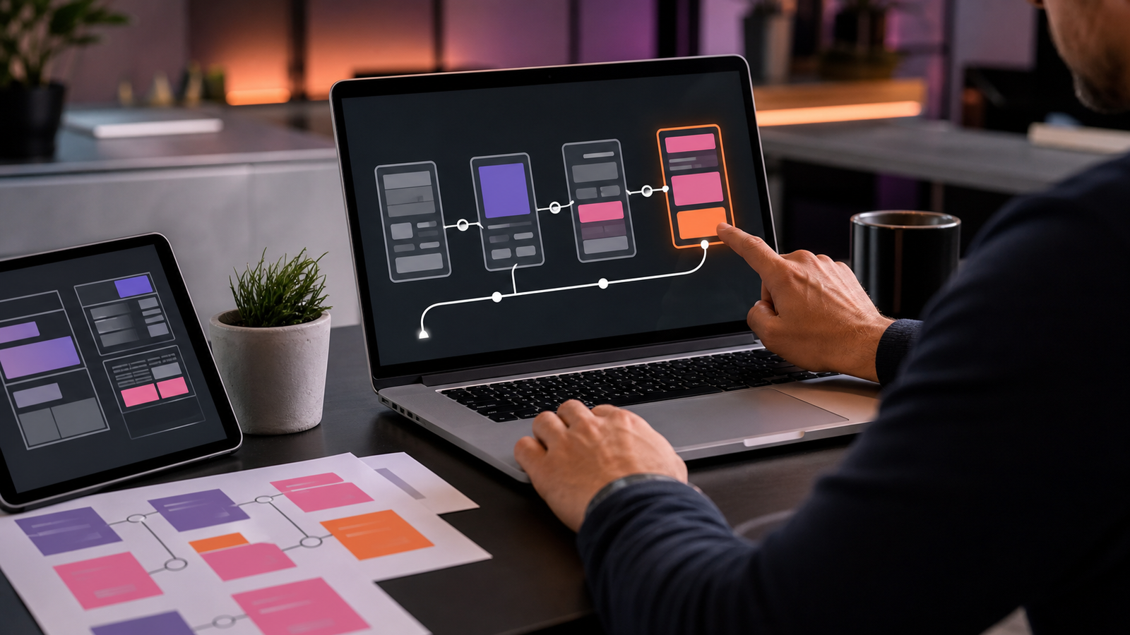
This is why copying another website menu can create problems. The menu should reflect your offer, your audience, and your sales process. When the structure matches how customers think, the whole website feels more natural and easier to use.
Frequently Asked Questions
What is website navigation?
Website navigation is the menu and link system that helps visitors move through a website and find important pages.
Why is website navigation important for UX?
It reduces confusion, helps users find information faster, and creates a smoother path toward conversion.
How many items should a main menu have?
Most small business websites should keep the main menu focused with about five to seven top-level items.
Are dropdown menus good for websites?
Dropdown menus are useful when they organize related pages, but they should stay simple, accessible, and mobile-friendly.
Can website navigation improve SEO?
Yes. Clear navigation and internal links help search engines discover pages and understand site structure.
How can Zevanta Digital help my business?
Zevanta Digital can improve your navigation structure, mobile menu, internal links, accessibility, and conversion paths.
Conclusion
Website navigation is more than a menu. It is the structure that helps visitors understand your website and move toward the right action. When navigation is clear, users feel more confident, less distracted, and more in control of their journey.
Overall, better navigation improves UX, supports SEO, and helps conversion paths feel natural. Therefore, every business website should review its menu structure, mobile experience, internal links, and analytics regularly.
Ready to Improve Your Website Navigation?
If visitors struggle to find your services, projects, resources, or contact options, your website navigation may be creating unnecessary friction. A clearer menu can make the website easier to use, easier to trust, and easier to move through.
Zevanta Digital can help you review your current navigation, simplify the user journey, improve mobile menu behavior, strengthen internal links, and create a cleaner path from first visit to final inquiry.
Contact Zevanta Digital to improve your website navigation and build a smoother UX that helps visitors find the right information with confidence.
Ready to Improve Your Website Navigation?
If visitors struggle to find your services, projects, resources, or contact options, your website navigation may be creating unnecessary friction.
Zevanta Digital can help you simplify the user journey, improve mobile menu behavior, strengthen internal links, and create a cleaner path from first visit to final inquiry.
Contact Zevanta Digital